This week I began creating my magazine page using the photo I had edited last week using Photoshop. The idea of the magazine article is to have the image of the face enlarged in the centre of the page. The reason I decided to create this design is because the image has lots of unique and interesting detail so enlarging it will grab the audiences attention because they will immediately notice this detail. It will also give them the chance to observe the image, which will engage them to the page, which is the aim of the design.
As you can see the whole page is filled up with the zombie image. This makes the poster stand out and the detail such as the wrinkles, the blood, scars and burns are noticeable for the audience which engages them. I decided to but the text at the bottom of the magazine page because putting it at the top would cover up all the detail on the forehead. Since there isn't any interesting detail towards the bottom i figured this was a good placement for the text.
I downloaded blood text and used this because it relates to the horror zombie theme I have gone with. I have created a pool of blood by using the blood splatter tools I downloaded to exaggerate the gore within the poster to excite the viewer.
For the bus advertisement i used the zombie face and put it toward the right of the bus and made sure the mouth was lined up with the wheel to create the effect of the wheel cutting away at the face. You can see that I have created blood splatters all over the bus to exaggerate the gore and create the wheel cutting away at the face effect. I used blood text for the BBC CULT logo to blend in with the rest of the blood that has splattered across the bus. With the blood splatter brushes I dragged them slightly to increase the amount of blood on the screen so it didn't all look like the same splatter brush.
Digital Graphics for Print
Friday, 21 February 2014
Friday, 31 January 2014
Unit 54 Production Diary - Week 5
This week I began the creation of the zombie for the magazine page.
The first thing I did was enhance the detail on the face and I did this by using the burn tool. The burn tool darkens detail on the photograph which is why I used it on areas such as underneath the eyes and and underneath the cheek bones to contour the face creating a tired and underweight facial look to relate to the zombie being ill and hungry.
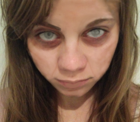
I used a soft brush and carefully did a few strokes over the areas to gain the look i wanted. When I was happy with the features that I enhances I airbrushed the face to make the darker areas blend with the rest of the skin. To do this I used a soft brush and used the alt button and right clicked on a section of the skin, which i then brushed around the face creating a softened and blended effect.
After this, I used the brush tool again to add some colour to the face to exaggerate the ill and infected look. I used a soft brush and a medium blue colour changing the opacity to 25% to avoid the colour looking too harsh. I then added this colour around the eyes and the mouth to create some bruising. I also used this colour to create stroked down the face representing veins and i did this because it will look like the blood is draining from the body exaggerating the zombie look.
I also added elements of red, blue and green around the eyes to make them look tired and infected. I added purple veins on the lips to make them look dry and cracked just what people would expect from a zombie.
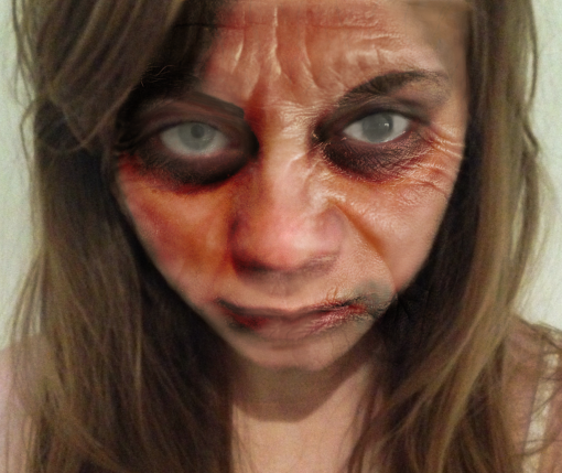
After this I got an image of an old man and used the texture of her face for the skin of my zombie. To do this I opened the image of the old woman into Photoshop and used the lasso tool to cut out her face. I then copied the image and pasted it onto mine. I then changed the effect of the image to overlay, which made the two image blend together. I then aligned the two faced together and changed the exposure and contrast until my desired look.
Now that I had the texture of the skin I went back to adding more cuts to the mouth by using the red paintbrush tool and more blue and green tones around the eyes and mouth to represent bruising.
By adding colour around the mouth it makes the viewer think the zombie has currently eaten something or someone which means they can use their imagination to create their own story behind the image. I airbrushed the lips by using the alt key and selecting the original lip colour that i then painted across the whole lips to make them look pale.
In order to create the splatter effects I downloaded blood splatter brush tools into Photoshop and they were very useful when making the final touches to my piece by making it that extra bit more gory and bloody.
After this I started working on the eyes. I did the same technique again by using an image of an eye infection and using this to blend in with the original eye. I used the overlay effect to make it blend and it gave me a result I was happy with.
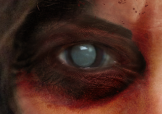
I went over the waterline of the eye with a paintbrush tool in a red colour to make the eyes look sore as well as using the burn tool to make the white part of the eye look dull so it didn't look fresh and alive.
While using the brush tool i added more red, blue and green around the eyes to exaggerate the gore and to make the skin colour of the eyelids and underneath the eyes look equal.
You can see here that they eye has a more evil and dark look to it and the texture is also visible. I used a dark black and dark red as a curved line underneath the eye to make the eye look sunken in and gory.
I decided to go back and add more dull colours to the face by contouring simply to make it look like the zombie has been infected for a while and wondering around outdoors for a while so the dirt on the face will show that.
To finalise my piece I added burns to the skin to make it look a bit more damaged
To do this I searched burns on google and various images came up of people with burns on their skin so i cut out the burn from the image using the lasso tool and pasted this on my image. I then used the overlay effect and altered the contrast so that it blended well with the skin to avoid it looking like it has been placed there.
For the burn on the forehead i decided to add more bruising and redness around it by using blood platter tools to make it look recent and gory.
I added blood to the nose by using one of the blood splatter tools i downloaded however It looked fake so i went in with the burn tool to darken closer to the nostril and added more red to the drip of blood.
After all this I ended up with my final piece. It turned out better than I expected and the gory and infected look I wanted was achieved which I am happy with.
This final piece is what is going to be used on the magazine page and the bus poster advertisement , which I will begin next week.
Unit 54 Production Diary - Week 4
This week I continued looking at YouTube videos firstly focusing on how I was going to produce the eye of the zombie. I looked at many different videos that all showed different ways of creating them and all looked very different. I narrowed each idea down to two that I liked the most and ended up choosing one of the two.
I like this creation of an eye because it looks very abnormal and creepy which is the look I want to give my zombie overall. Using the black will relate to the horror and sci-fi the channel offers giving the audience a clear understanding to what type of channel they are watching. The downside to this is that it looks more like a demon eye and doesn't link well with the look I want for the rest of the face which is drained, ill, abnormal and cold.
Out of the 3, this is the eye I prefer the most because red is a colour I will be using a lot through out the design so it will link well with other aspects used in the design. The eye looks scary, sore and dramatic, which is the look I want for my design to scare the audience and fascinate them with something that looks extraordinary.
The last type of eye is a lightened eye, which I have found is quite simple to do and isn't as time consuming as other aspects of the bus will be, which means there is more of a chance of me meeting my deadlines. I think the look is very ill and infected looking, which relates to the zombies because they have been infected with an illness. This eye will stand out to the audience and it is important for every aspect of the bus to stand out to grab the audiences attention, which is why I have chosen this idea to re-create on my final design.
I took the photos for my final design, one of my little sister who I would be transforming into the zombie using Photoshop.
I took the photograph early in the morning when she had just woken up because this is when her hair is undone which would make the zombie look look more realistic once edited.
Tuesday, 3 December 2013
Unit 54 Production Diary - Week 3
This week I finished the design sheet for the bus advertisement and began the design sheet for the magazine advertisement. I searched a variety of different weapons I could place in the background, to exaggerate the gore as well as looking at colours and textures for the backgrounds. I completed the magazine design sheet by drawing the design and annotating it, explaining why i was using certain aspects and how it relates to the channel.
I began thinking of the props and costumes I would need to use and because I am going to create the zombie look on the person in Photoshop all i will need for the makeup of the zombie is wax to make the hair look greasy as if it hasn't been taken care of in a wile giving it a rough and messy look.
The texture of the skin and blood will all be created in Photoshop.
For the background of the poster I will be taking a photo of branches of trees facing up to the sky because it will give off a scary atmosphere because people usually find dark woods rather spooky. For the weapons and tools I will be photographing them from home by using a companies tools - TaliLTD.
I have began looking at Youtube videos to get an idea on how to produce a realistic looking zombie that the audience will be fascinated by.
Tuesday, 19 November 2013
Unit 54 Production Diary - Week 2
Through out the week
I began designing the poster for the bus advertisement initially by drawing the
layout of the bus, which I then drew my final design idea onto. After this I
wrote the concept of my design explaining why I chose it, what inspired me, why
I think it is suitable for the BBC Cult as well as appealing for the target audience.
The next thing I did was think about what
textures and colours I wanted to use for my poster that would suit best for the
BBC Cult and the genres of the channel – sci-fi and horror. I got textures for
the metal saw, the blood that will be spread across the bus and the background
of the poster.
I annotated all aspects of the bus explaining
why I have chosen to use the design followed by examples of colours and
textures that I would like to use explaining the reasons why I think they would
be suitable to use.
Tuesday, 12 November 2013
Unit 54 Production Diary - Week 1
Tuesday 5th November - Tuesday 12th November
Through out the week I have began generating my ideas for the bus advertisement. I used a generating ideas sheet to note down ideas for the wheels, windows and bus doors to come up with a range of creative and unique ideas.
After looking through my
ideas I decided that I definitely wanted to go with the zombie horror theme. I
used one idea from each section on my generator sheet for the wheels,
windows and doors. The reason I did this is so that there is not a boring
sector of the bus, having the whole side of the bus filled with imagery and text will give the audience
something to take their time looking at, which will engage them. It will also
make them think the channel will have a lot to offer, just like the advertisement,
making them want to watch the channel.
An idea i really wanted to produce was a character from the walking dead stabbing a zombie by leaning them over the wheel. However, I cannot use the character because using them for my ident would be very unlikely and it is also unlikely to get a shot of them doing exactly what i want them to do on the internet so this was a dilemma for me.
The final idea i decided to do was to have a zombies face at the side of the bus which would be aligned with the wheel and the wheel would act as a metal saw that would have the illusion of the wheel or 'saw' ripping away at the zombies face. As the blood spreads across the bus the blood will read 'BBC CULT'. On the doors of the bus I will have a human on the left and a zombie on the right so that when the doors are open it will look like the zombie is going towards the human and when the doors are closed it will look like the zombie has grabbed the human.
I feel that this is a successful idea because it gives the audience not just one thing to look at, but it will give them a few. The idea of the wheel being a saw will interest the audience because it is a unique idea so they will take their time looking at it, and the illusion that comes with the doors will fascinate them also since it is different to what they would usually witness.
I think this is a successful idea because it is different for the audience which will interest them and the progress is coming on well because it is an idea that i have worked on and built on, since originally I was just going to go with the zombie idea with the wheel cutting away at the face. However, the metal saw is something i came up with when thinking about how i could use aspects of the bus in order to make my piece unique.
I completed my proposal, which goes through my idea, the style of it, the unique selling point and also the way it meets the needs of the client and audience.
I am now in progress of doing my design sheet, which is where I have drawn out my bus idea, but I need to look up different textures and colours that i am using for the advertisement which i will then paste onto the design sheet and write about why I will be using it.
Tuesday, 5 November 2013
Subscribe to:
Posts (Atom)